Welcome to week two of the One Room Challenge. I hope you enjoyed the ‘glamorous’ before pictures of the basement in our new home last week! If not, go ahead and catch up on week one here

Not Familiar with the One Room Challenge
The One Room Challenge is a bi-annual event where interior designers, bloggers and design enthusiasts participate in transforming a space of their choice and blog about it every week for 6 short weeks, I will be sharing my progress every Thursday for the next several weeks. So be sure to watch for those weekly updates.
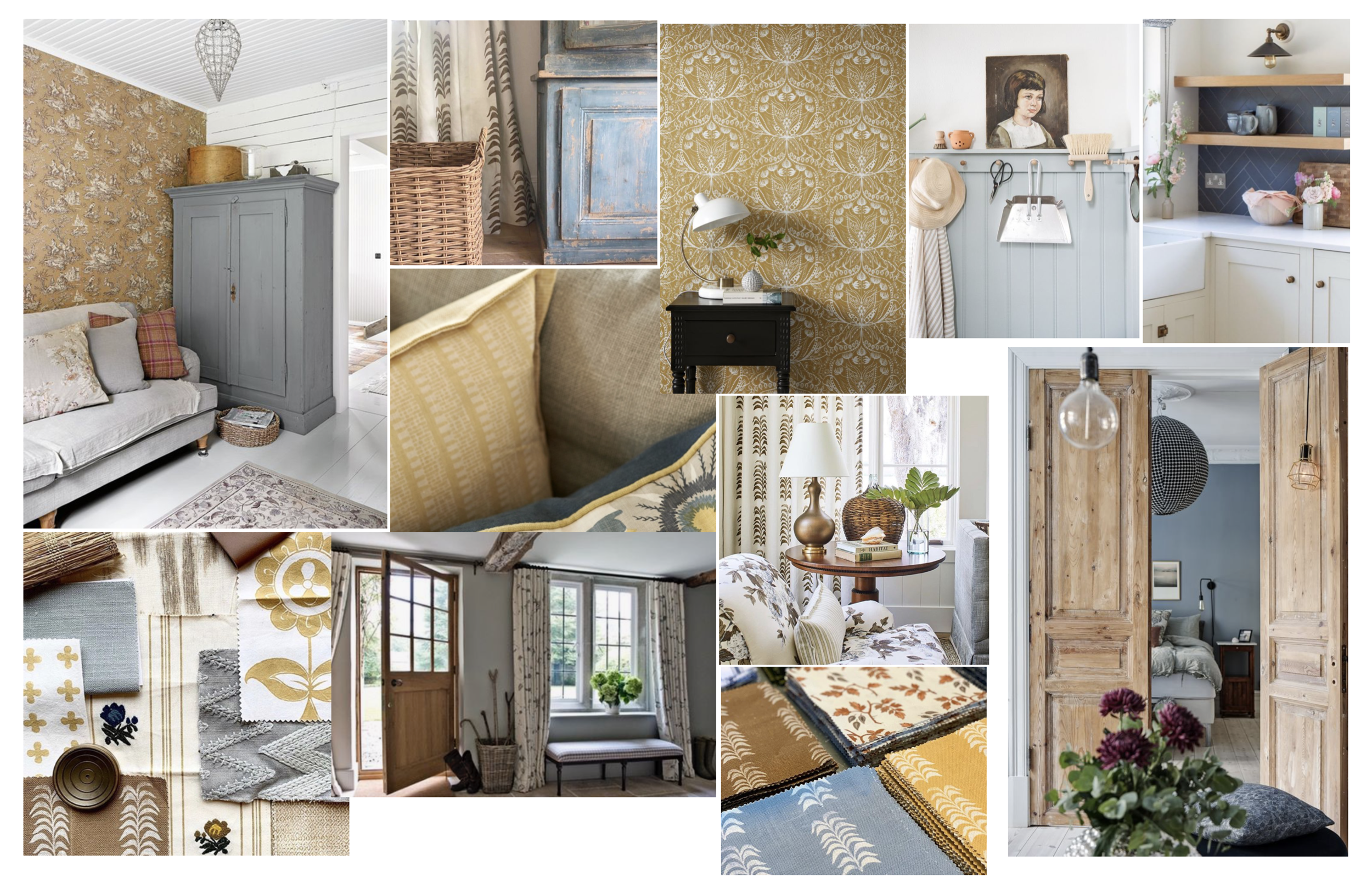
This week I’m sharing the inspiration and design concept for the basement. As is very typical for the North East our new home is colonial style. While the outside is very classic, the interiors are lacking in any overall style, the design elements that are present tend to be very traditional and a bit fussy. My goal is to bring the classic, timeless and livable aesthetic, that we provide for our clients, to this home with a modern English country house feel. Now when I say english country house I’m not talking fussy florals and victorian antiques, I’m working more towards a comfortable and welcoming space with the perfect mix of warmth and texture.
So here is my inspiration board for the basement…
BASEMENT PLANS
The basement will be a secondary living area for our family so creating a cozy and comfortable space is important. It will primarily be the kids domain but with direct access to our pool we foresee summer entertaining extending to this space too. When designing this space I was mindful to create a space that was both light and bright, but also felt warm and cozy…a space that will be inviting to both adults and kids, and a space that is practical and fits our lifestyle.
So let’s start with the floor plan….
Not much is changing with the structural layout, the L-shaped space is pretty much the same with the biggest difference being that we’ll close up the doorway in the bar area. There is another door to access the mechanical/storage area so we don’t really need this one. Closing the doorway allows us to drop the soffit down to the same level over the cabinet area creating a nice clean design, plus we can also install a full wall of cabinets, and there is no longer a walk-way issue with the furniture plan.
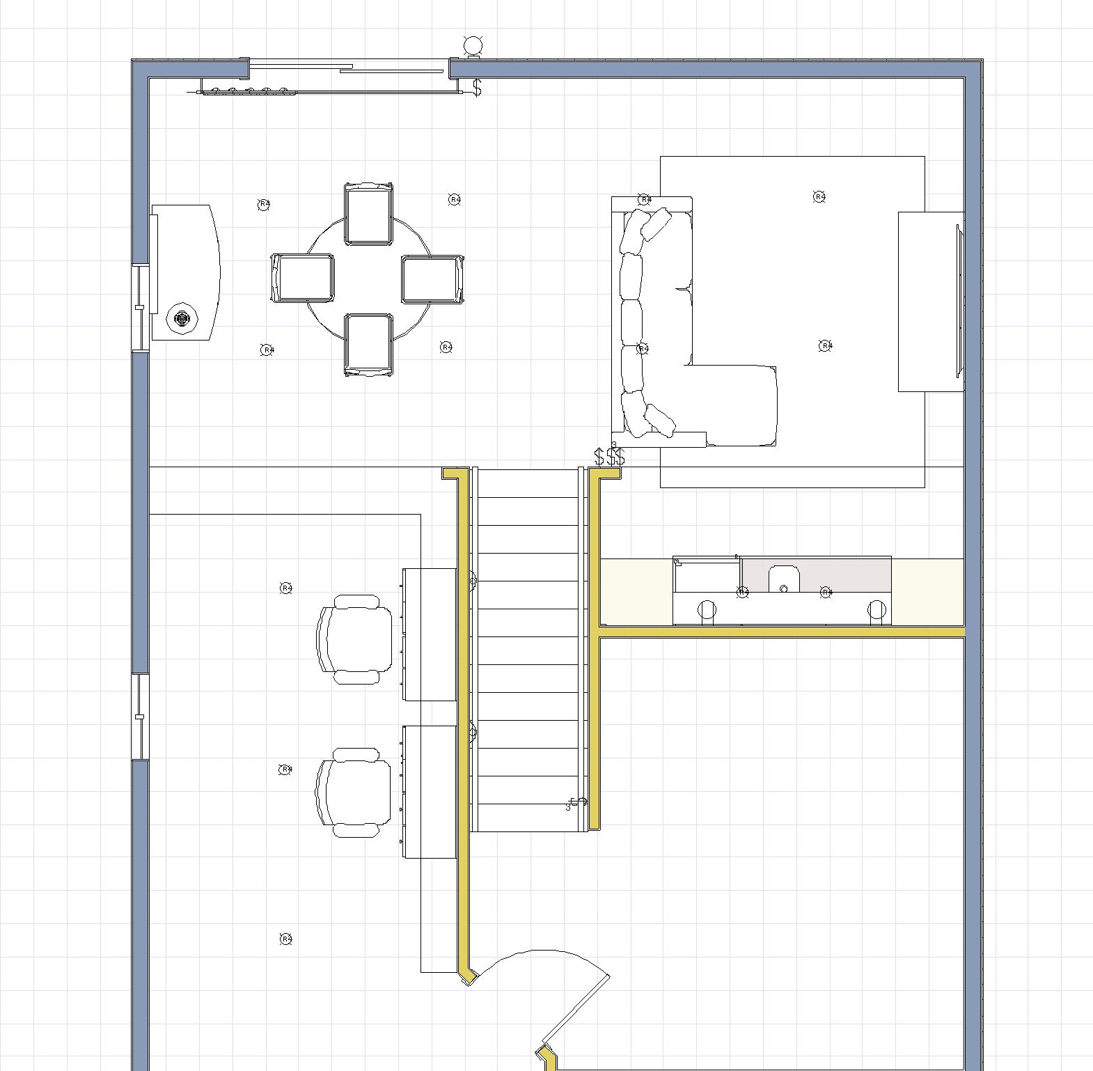
While the door is the only thing that really changes as far as the plan goes, there is a lot of work to be done before we get to any of the pretty stuff….
Here’s what’s on the construction To-Do List
-
Remove ceiling tiles and drop ceiling grid
-
Remove existing lighting
-
Install new recessed lights, stairway sconces, electrical
-
Remove chair rail
-
Remove wallpaper throughout
-
Install framing for new drywall ceiling
-
Install new drywall ceiling
-
Skim coat and sand all walls and ceiling
-
Paint walls and ceiling
-
Install new floors
-
Install new cabinets and countertop
-
Install tile backsplash
-
Replace windows and sliding door
WOW!! That is a lot of stuff, and doesn’t even get started with the decorating.
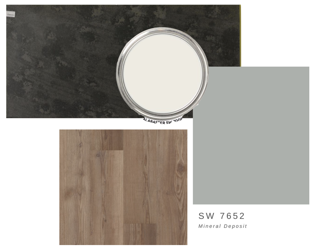
Here are some of the hard finishes I’ve chosen…
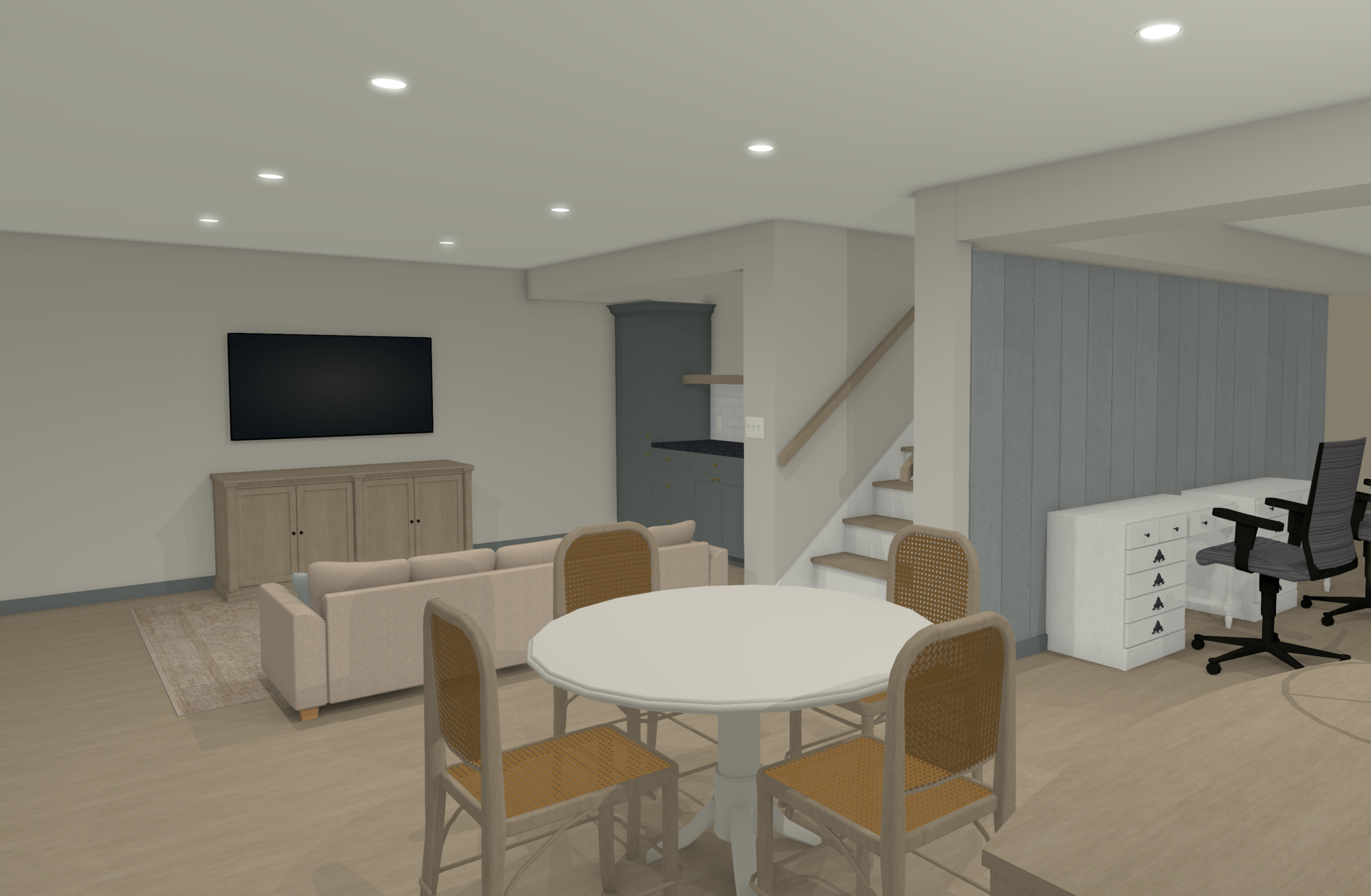
The overall wall color will be Sherwin Williams Alabaster, the cabinets, trim and a vertical shiplap accent wall will be painted SW Mineral Deposit. The wood swatch will be our new luxury vinyl plank floors and the black swatch in the back is the material for our new countertop.
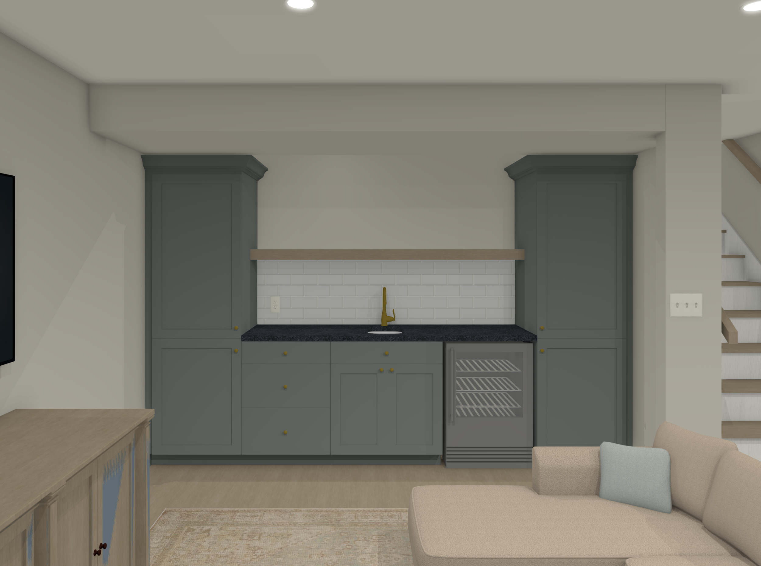
And if you’re still struggling to visualize everything here are a couple 3D renderings that might help……
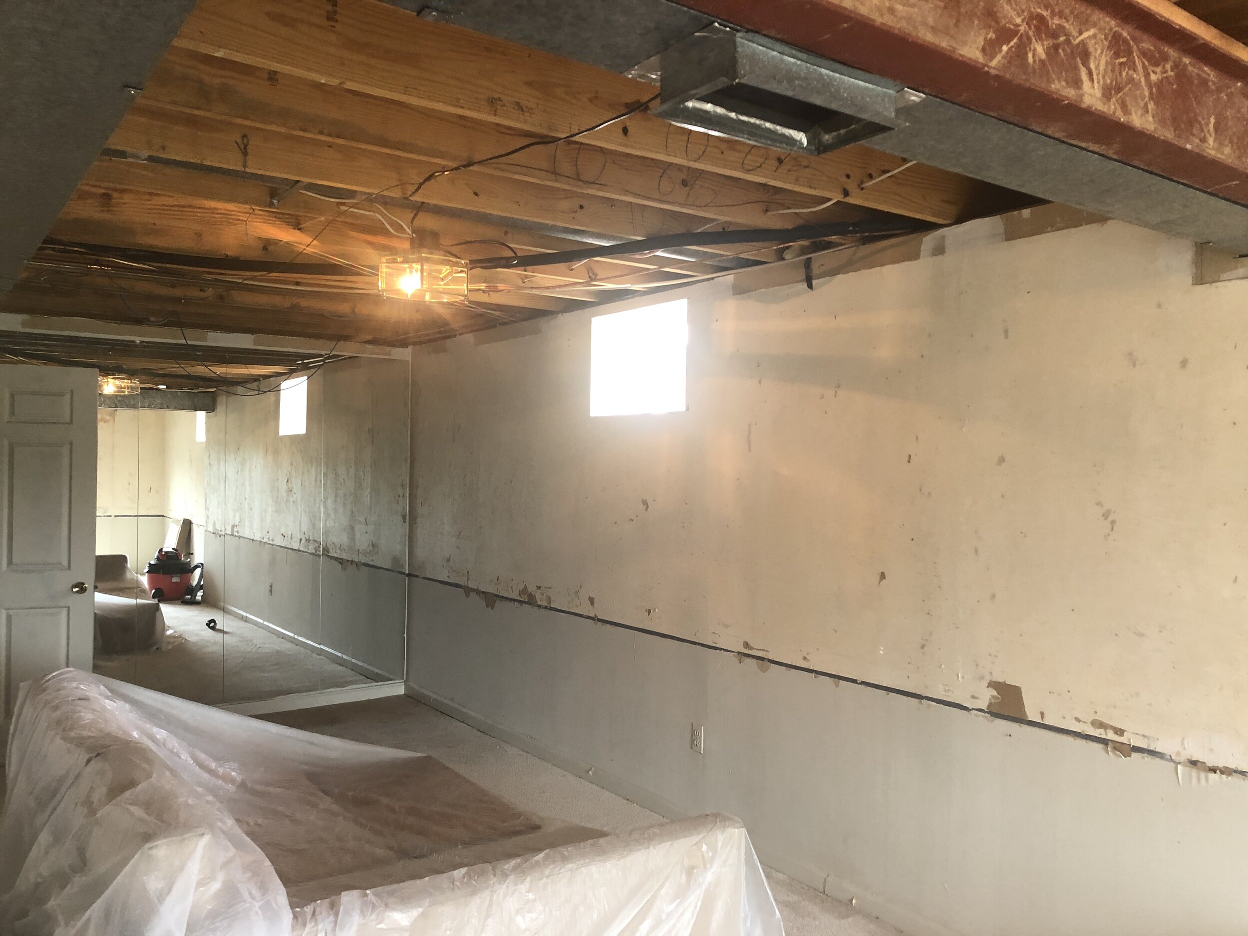
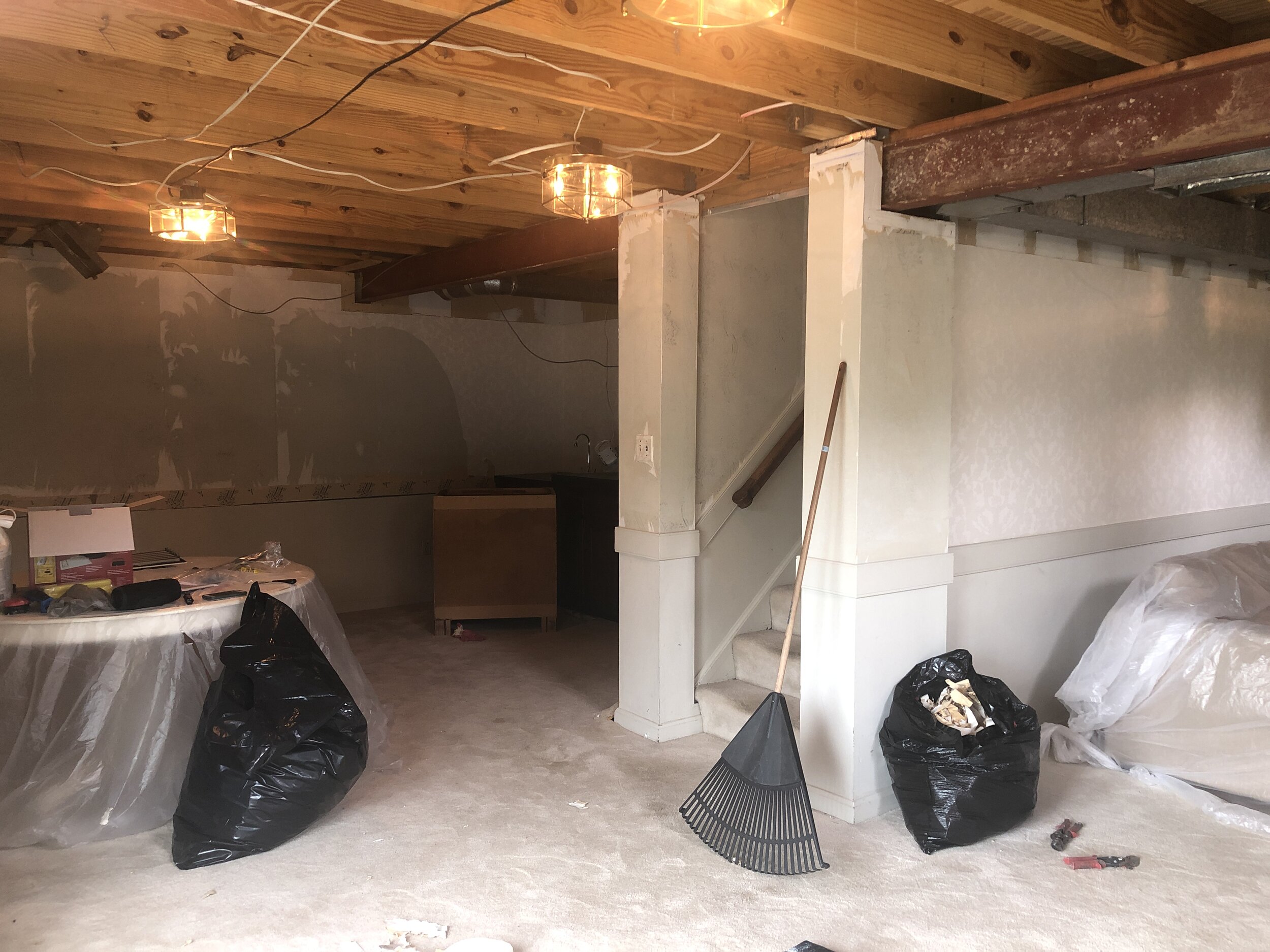
Now that I’ve shared all the construction plans… how about a few progress pics?
WARNING!! It looks more like we’re creating a haunted house than a designer basement. 🙂
Thanks for following along…I’ll be back next week with more progress shots and the decorating plan.
Looking for more inspiration? Be sure to check out the other guest participants here.


leave a comment